A new graphic identity for Renault group
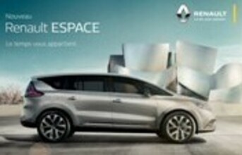
Along with Renault's new brand signature, the brand's graphic identity has been reviewed and redesigned, too, by in-house teams working out of its Corporate Design Department. This evolution concerns all the company's advertising, both audio and visual (TV, print, posters, radio, etc.), as well as websites, exhibition stands, special events, merchandising, clothing, etc.
Meanwhile, the Renault diamond has been made bolder and has been freed from the confinement of its surrounding outline. It features the same more generous, higher-status, brighter logo that adorns the front of the brand's latest models.
The brand block has changed, as well. Although its draws its DNA from Renault's past, it stands out as more modern and more assertive. It also features a new, specially developed typeface designed to add a distinctive touch to the brand's communication.
The Renault yellow, which has been made brighter and warmer, is visible as a vertical strip to the logo's right. The result is a refined graphic identity that elegantly expresses the value of the brand's products. This more creative and emotive approach is in line with the mission that was given to Laurens van den Acker, SVP, Corporate Design.
"When I arrived in 2009, my mission was to reforge the emotional bond between the Renault brand and its customers," notes Laurens van den Acker, SVP, Corporate Design, Renault. "My response was to ask my teams to rekindle Renault's Latin roots by designing colourful, personalisable cars with sensuous, muscular lines that spark emotions and make everyday life more pleasant."
The Groupe Renault's new corporate identity, which will cover the Renault, Dacia and Renault Samsung Motors brands, will be revealed at the Groupe Renault's next General Meeting at the end of April 2015.
End


